donderdag 3 november 2016

The End

Over the course of the last pages I haven't really kept track of how I was working on them. I followed the story line as you can see in the final product. The printed version has turned out quite nicely, and I'll post some images below. Below you'll find me reflecting on my own work.

Likes
- I like that the final product has the general feel and look that I was aiming for.
- Certain pages look pretty like the mostly black pages. They are my favorite.
- The colorscheme is pretty
- The riddles have turned out quite well

Dislikes
- The paper
- The concept
- The storyline
- The water-color-design

What I'd do differently next time
The paper hasn't really turned out the way I hoped it would. Printing it on plain slightly thicker sandy paper made it look hideous. In the end I settled for a thicker glossier paper then I wanted. The next time I'd consult with the printer earlier to get is just right.

The concept is maybe not that bad in and of itself I'm just worried that I doesn't suit the target audience, and that it looks far to mature. I'd try and get that in check next time. Maybe by showing some of the works to children.

The riddle-story-line-information is a horrible idea quite frankly. After I was done I really didn't understand why I didn't settle for a normal story line: Have Morgan discover some special powers, wake up in a black-and-white world etc. Maybe I was too caught up in my own idea to look at it with fresh eyes and see the importance of a better story. Idea fixation or something.

The water-color-design. I guess that it's not that bad. But I really wanted to achieve a more painted kind of look that looks like ink on the actual paper.

Final Conclusion
I guess that in the end the content doesn't look that bad. It has the look that I was going for and all in all I do think that it provides lots of good information in a fun and engaging matter. Which was the whole idea behind the concept anyway.
It has taught me many great things this project: My Photoshop- skills aren't as bad as I taught. I learned to work with layer-masks (Which I had never done before). And through it all I really saw the importance of a good story line. You'd think I would have gotten that through the course of my education, but apparently I needed to be reminded.

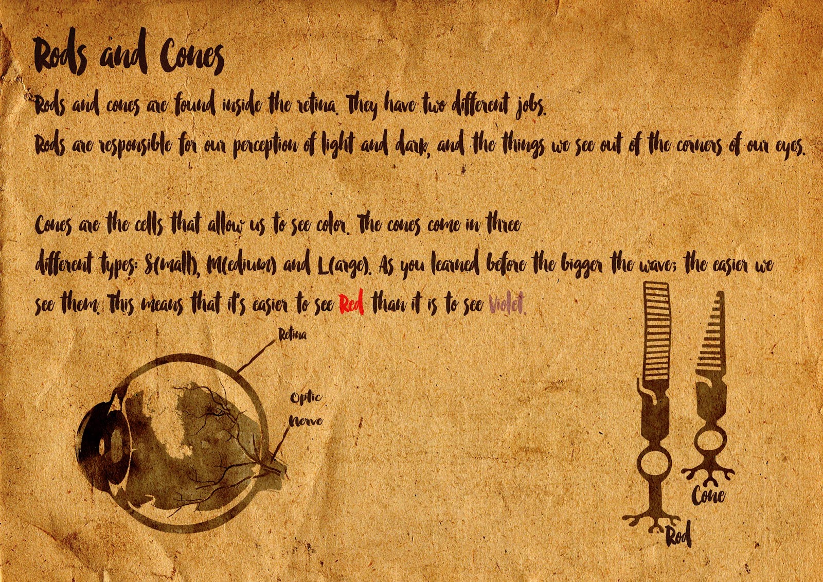
Below you'll find some of the imagery that I created. The final document is uploaded on Hubl.
Thank you and goodnight.


After Doubts

I had some serious doubts. Looked at my concept and I still think it's a valid idea. Maybe the look that I've been pursuing is to artistic for children to enjoy and a tad to cryptic.

The main reasons why I've decided not to look into another option is because I believe that I would have really loved a book like this as a child growing up. I guess that subconsciously that has played a role in me creating this concept. So I guess I'll just have to go with that. Time constraints is another problem as well. Also, my 10-year-old cousin says she would love a book like this. I guess I just have to believe her. Or I want to anyways.

The work on the back page of the eyes has turned out quite nicely. It's one of the pages that I enjoy looking at. Maybe because it's mostly black. I wish I would've done everything in black and white. But making a book about color in black and white is kinda impossible. Or well maybe a really good new concept.


Storyline 2

Now I have to find a way of disecting all of the information into easy to understand information. 
The general idea is:

Waves and rays -> What is it we actually see?
How do the waves/light get into our eyes -> What happens with it?
How is the light translated into color? 
What are the differences between humans and animals?
Create an ending. 

This all sounds quite straightforward but knowing what to select is quite difficult. I'm starting off with the waves and rays. 

Front


Back


At this point I'm seriously doubting everything. I think it's super ugly and too conceptual and out there. Maybe what I'm making is highly age inappropriate and no child will even get it. Not really sure what to do. 

Story line

This time I'm mainly focusing on the story line. Caspar gave me feedback that I needed to think more about the story line, instead of focusing on visuals so that's what I'm trying to put into practice.

I've been racking my brain in deciding or not whether to go into an actual story line. Have Morgan experience and learn something. But my main idea was to incorporate information with a sense of mystery and engage the children themselves. The riddles and the info should be key.

Therefore I'm deciding to amp up the riddle factor of the book and have it be some sort of scavenger hunt. The front will only showcase the Haiku and some imagery as to provoke reaction from the children. The back will then be more detailed and explain the matter in a quirky, offbeat way. I'm trying to use some "older-sounding" language in order to have Morgan come across as wiser and more ancient, someone who's been around forever and sounds like an authority on the subject. The only thing I really made this time is the back of the cover and the introduction.

For the back I was thinking about asking for the child's name. And I started playing around with candles and such for a dated feeling. I finally settled on the Milky way cause I think it sets a better tone and doesn't make the children feel like they're reading a book from the olden days.

For the introduction I set the story of with a calligraphy letter, as to have it be an old-fashioned nostalgic fairy tale feeling. Also I wrote the intro.

Backside


 Introduction


Second Draft

I've been thinking and researching my project. No major differences this time around. Due to the fact that I haven't really been able to connect with my group mates I ask my classmate Mila for some feedback. She likes the final look that I've settled on. but she wonders how it should indicate that it's a book about how the eyes see color.

That is a pretty good question! And also a pretty obvious one. As I've been so busy on getting the look and the feel right, using Images and symbols to convey a mysterious, fantasy like feeling that I haven't really been dealing with the knitty gritty of it all. So that's what I am going to do starting now.

The feedback got me thinking about the cover and that I should maybe take it literally. Miss Morgan is traveling into the eyes, so why not have her appear in the eyes. Also I've been looking for a good font to use that has a "ink-feel" to it. After a lot of searching I've settled on Smitten as a font cause I really like how it comes of. Through playing with the opacity of it, it looks more like it's been painted on the page. Below you'll find the first draft version of the cover, and the final edition of the cover.

First Draft


Final Version 


First Draft

I've started working on the first page. The cover so to say to get a general idea of the project and a gist of what it'll eventually look like. For days I was thinking about who Morgan should be and what she should look like. Because I can't draw I plan to use photo's and images and manipulate them into my aesthetic.

Eventually I landed on Eva Green. Because I like the certain kind of mystery that surrounds her and I think that makes her a great fit for playing a sorceress in my book.


As I start working on Morgan's look through tutorials this is the first look that pops out. What I like about the image that I have created is that it shows the water-like paint look very well, especially in the lower part. What I dislike about the image is that it's still too much like a photograph and it doesn't look dreamy/auqarelle enough.

This is starting to look a lot more like how I want the book to look. The defining of the hair is better this way and I like that it's sharp and that you still see the contours properly, I don't want it to look smudgey.

I played around with the top Layer and added one in a Linear burn to give it a more worn out look. This is has become the General aesthetic that I will be gearing the whole books towards. Throughout I've been experimenting with making it look more like ink on the paper. But to no avail. This is what I'm working with because I like the look, I think the colors look great and it shows a certain sense of mystery.

Final Concept

After explaining the concepts and getting feedback from the group, I've devised a new concept that incorporates several aspects of the three separate concepts into one:

Morgan is a sorceress whose job it is to explain the riddles of life. This time she focusses on how eyes see color. With a magic spell she takes us into the eyes. Every page is then filled with a Haiku (a riddle of sorts) that stimulates the children to use their own imagination. On pages in the back the entire story (text) is then explained for parents to read along so they can help them figure stuff out, or the older children themselves.

The visuals will be in a watercolor-like painting style. With muted colors (lilac and such) to create a dreamy atmosphere, which is also a bit nostalgic (due to the sepia tones). Below are some examples. I like the color setting of the first picture and the visual style of the second.


I Think that the concept is appropriate for Children in Western Europe because it introduces a playful way of learning new things. Through active participation, the Haiku's, they are forced to think about things instead of having the information handed to them on a silver platter. This helps them retain the information better and also, it helps them utilize their imagination in a world that seems to be more and more focused on reality than cultivating the strength of the imagination. Strengthening their imagination also helps the children become more creative. So it will have double effect: provide info and stimulate them mentally.

The riddles are chosen because it's a slightly more conceptual way of thinking, but not as symbolic as to recoil them. Because children of those ages are still drawn to concrete things rather than symbols I'll use images that are very common (unless that's impossible) or try to make things more concrete through the explanation. In line with the Japanese concept proposal I aim to minimize the info and have only bare necessities on paper, because it has to be a guideline for their thinking instead of dictate.

The format that I've selected, after a lot of thought, is A4. I want to present it in a horizontal way, so that every page is double printed: a front and back. I've chosen this format because I want children to be able to take it with them wherever they go and solve their riddles everywhere. The metal ring that I want to use to bind it will give it a workbook/notebook look and feel. A bigger format such as A3 will it more inconvenient to travel with (speaking out of personal experience with 'Reis Naar Woudland'), and a A5 template will make everything far to small to read and I'll end up loosing detail. Although A4 seems like a generic thing to select, I've actually given it a lot of thought.